
Responsive Elements
Responsive Elements are a small set of ready-to-use building blocks in the Cross-Screen Creator Word Template for presenting information visually. They were chosen because they adapt naturally as the reading space changes.
Use them when they make the communication clearer. They are not a checklist; most of a document can remain regular narrative.
Cross-Screen Creator includes five color themes designed for professional reports and long-form communications. You can also use the themes included with Microsoft Office or create your own.
Cards

Present three or four related ideas or actions as a concise set. On narrower screens, the cards stack.
Key Metrics


Present a few important measures together for quick recognition. On narrower screens, the metrics stack.
Highlight


Give a conclusion, recommendation, takeaway, or central idea additional prominence.
Identity


Introduce a person, organization, place, or other subject with concise identifying information and an optional image.
Narrative + Narrative


Present two related or contrasting ideas side by side. On narrower screens, they stack while remaining associated as a pair.
Narrative + Visual

Combine explanatory text and a visual when they communicate one idea together. On narrower screens, they stack.
Supplementary Note


Add context, a caveat, definition, or related information without interrupting the main narrative.
Tables
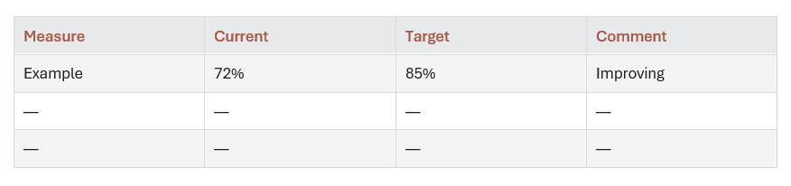

Present concise information when rows and columns help the reader see relationships. On narrower screens, tables scroll horizontally rather than being squeezed to fit.
Visual

Give an image, chart, diagram, or other visual its own place in the reading flow.
Visual + Visual

Present two visuals together when their relationship matters. On narrower screens, they stack while remaining associated as a pair.
See the responsive elements in action
The sample publication, The Changing Reading Environment, uses many of these responsive elements. Try it on your computer and your phone and see how it adapts to each screen.
View the sample publication
Scan to open on your phone
Back to the Cross-Screen Creator page